
Design System
A scalable design foundation for IPMD and its growing product ecosystem, built to create a system that remains consistent, and easy to scale across different experiences.
Role
Product Designer
Organization
IPMD
Timeline
2026
Scope
Design System & Documentation
Why create a design system?
As IPMD expanded across different products and initiatives, each experience began developing its own visual decisions. Without a shared foundation, common interface patterns could become inconsistent and harder to scale across projects.
01
Inconsistencies
Similar UI elements were using different typography, spacing and colors
02
Repititions
Common components had to be recreated across different projects instead of reused.
03
Difficulty scaling
Without shared rules and documentation, maintaining consistency became harder
Where the existing system was breaking down
Before defining new standards, I reviewed existing IPMD interfaces and documented recurring visual and interaction patterns. The goal was to identify where similar elements were being treated differently and where shared rules could reduce ambiguity. Most inconsistencies came from the absence of shared decision-making rules. The system therefore needed to define not only how elements looked, but how designers should choose and use them.
Building the system's foundations
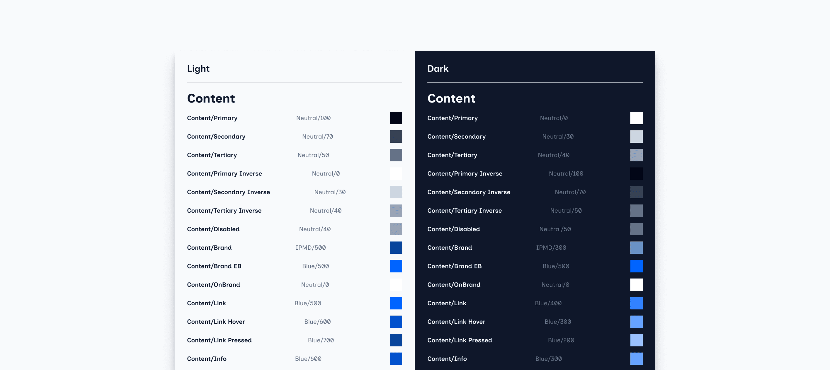
I structured the design system in layers, starting with reusable foundations and semantic variables before moving into components and product-level patterns. This made the system easier to understand, maintain, and extend.
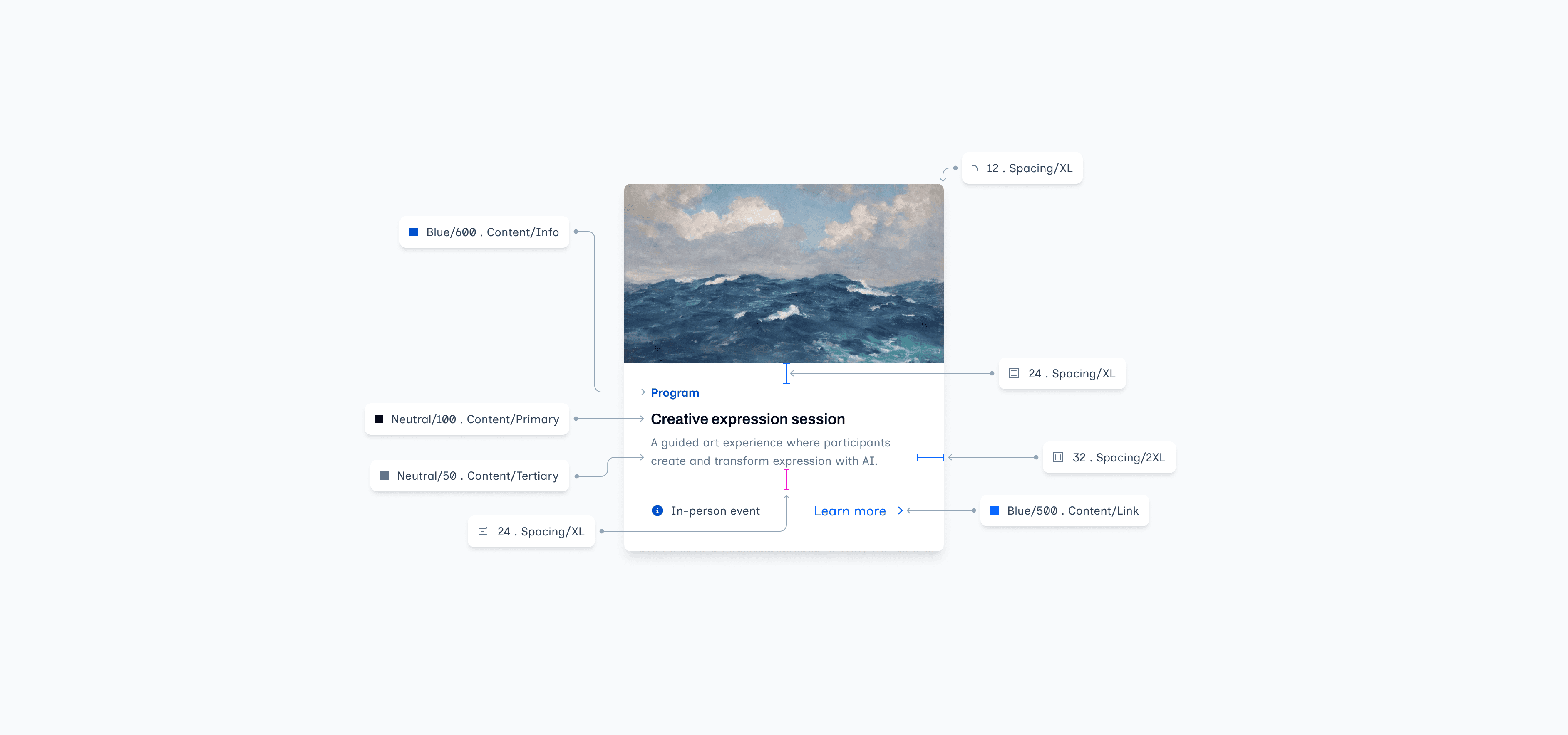
Creating reusable components from shared rules
With the foundations and semantic structure established, I translated the system into reusable components designed to support different products and content needs while preserving the same underlying interaction and visual rules.

The anatomy of all components is built from the same shared system of spacing, typography, color, radius, and icon rules rather than being defined independently.

Making the system easy to understand and use
A design system only works when its rules are clear to the people using it. Alongside the component library, I documented foundations, component behavior, usage guidance, and implementation details to reduce ambiguity during design and developer handoff.

Components were paired with clear instructions describing their purpose, structure, variants, and appropriate use. This helps future designers understand not only what is available, but when and why each pattern should be used. The goal was not just to document what the system contains, but to make its decisions understandable and repeatable.
From system to product
The design system was applied to EchoBloom to test how well its foundations, semantic rules, and components could support a real product experience. The goal was to maintain a shared system while still allowing EchoBloom to retain its own visual personality.

Faster decisions
Common visual and interaction choices no longer had to be redefined for each screen.
Shared language
Components and semantic rules created a common vocabulary between the system and the product.
Product Flexibility
EchoBloom could still use its own imagery, tone, and content while relying on the same underlying rules.
The system provides structure without forcing every product to look the same.
Creating a foundation that can grow
The final system established a shared foundation for designing IPMD experiences, bringing visual rules, reusable components, and documentation into one structured library. Applying the system to EchoBloom also helped validate how those decisions could translate into a real product experience.

01
A shared visual language
Common foundations for typography, color, spacing, radius, iconography, and elevation reduce arbitrary decisions across new interfaces.
02
Reusable components
Frequently used interface patterns can be assembled from shared components rather than redesigned independently for every screen.
03
Clearer handoff
Documentation and consistent naming make the intent behind components easier for other designers and developers to understand.